BREEZLE
Advanced Interaction Design for Virtual Reality in the Health Sector
Project Overview
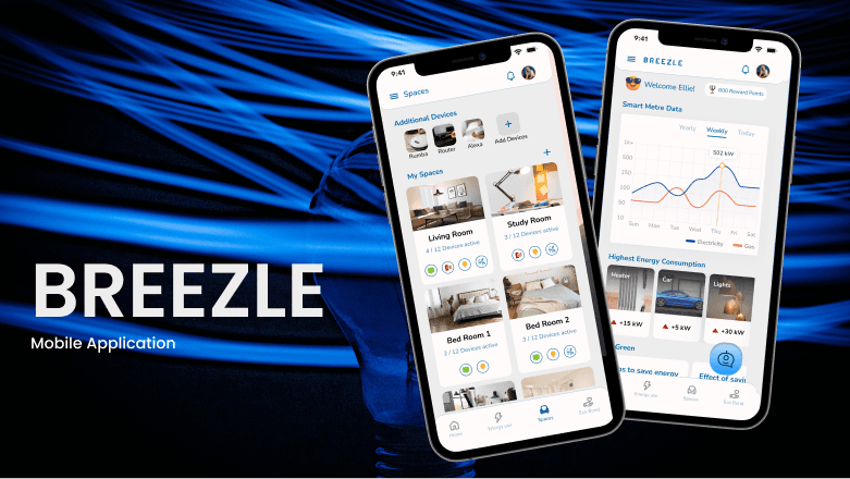
Breezle is an app designed for money rich parents helping them save energy, enjoy more family time, and adopt behaviours that contribute to fighting climate change in collaboration with GenGame Ltd."
"The project aims to shift behaviours and attitudes towards domestic energy conservation, aligning with GenGame's central mission of fostering consumer engagement with sustainable energy technologies, including electric vehicles, solar energy systems, energy storage, and smart meters."
Design Process
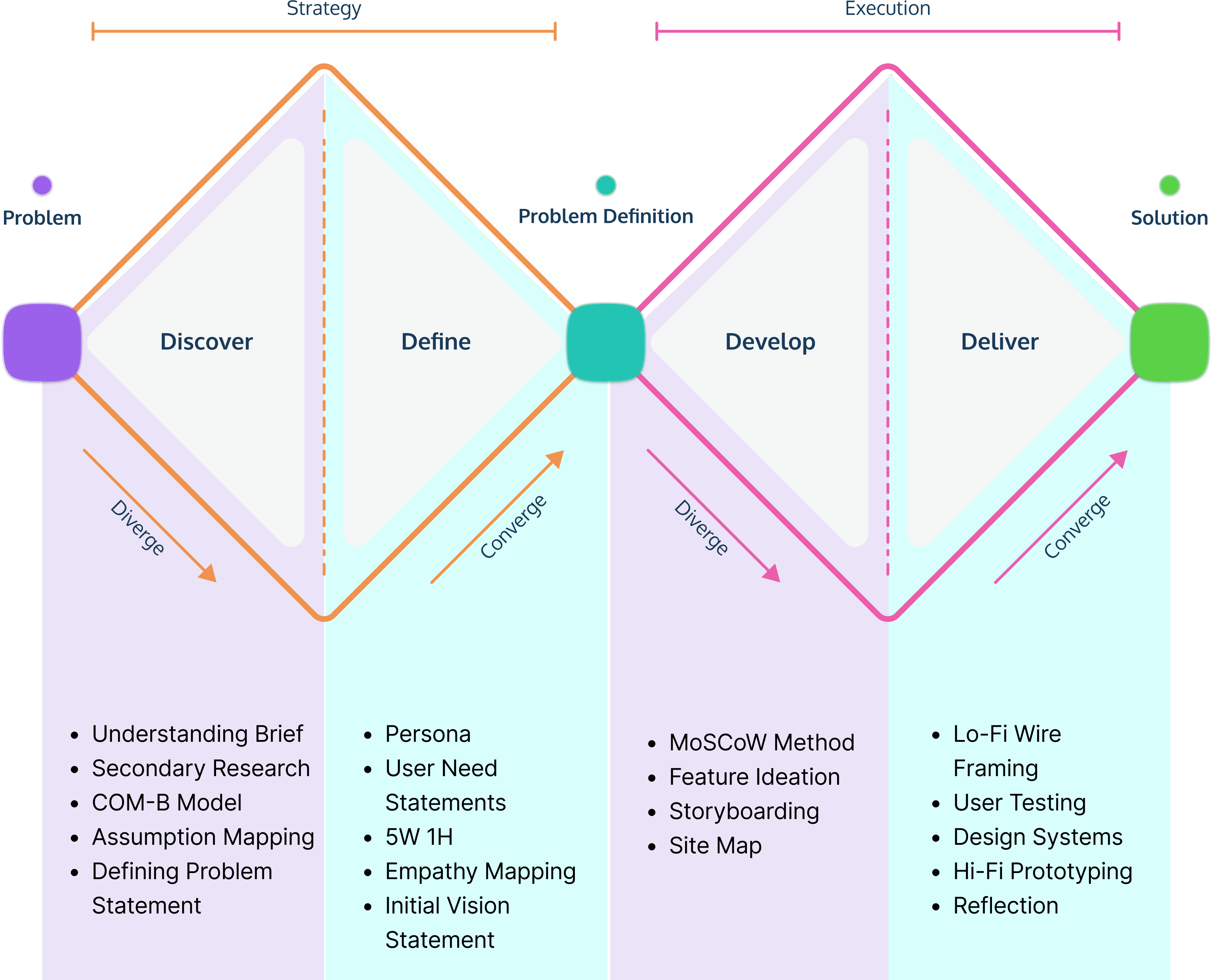
DISCOVER
Project brief
"With climate change escalating and domestic energy consumption contributing significantly to carbon emissions, urgent measures are required to mitigate its impact. Despite the availability of renewable energy sources, shifting rapidly poses challenges to the current energy grid. It must address the dilemma of reducing energy consumption while ensuring comfort, leveraging smart meter data to empower households in combating climate change effectively.
Target Users
“The Young good life family” (comfort-first consumers)
To spend time as a family doing the things they enjoy this family won't invest in upgrading their home if it means disruption.
This family is cash-rich and time-poor, and doesn't want to feel restricted or limited without just cause; they want fun!
To gain tangible reward for the effort they make to reduce their energy use.
Secondary Research
“Smart meters are the next generation of self-reading gas and electricity meters that let you see how much energy you are using in pounds and pence – so it's easy to keep an eye on how much you are spending, however you choose to pay for your energy”. (British Gas, 2024)
“"A study found that families spend more time with devices than each other, with mobile devices accounting for 38% of total family time and 47% of 'alone-together' time in 2015." (Killian Mullan, 2019)
Competitor analysis

COM-B model
The COM-B model was used to map assumptions for target users (family). It raised few questions which needed to be addressed in the designed.
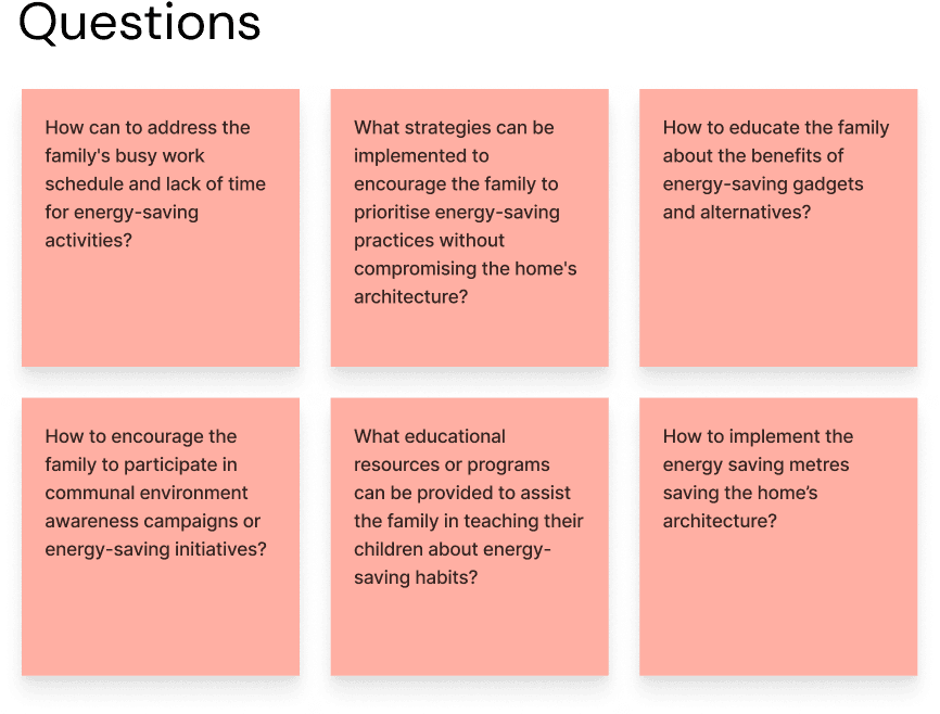
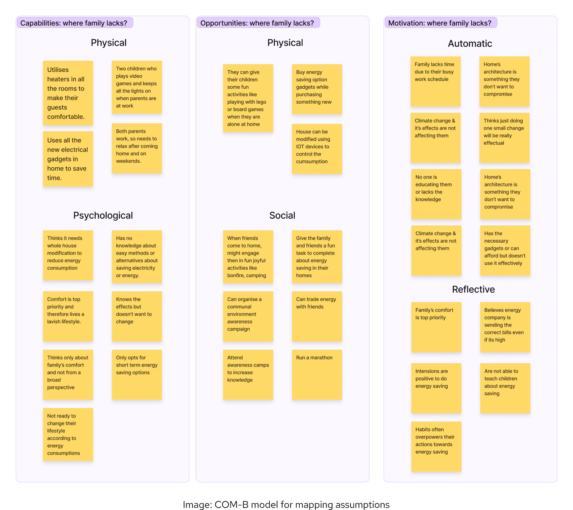
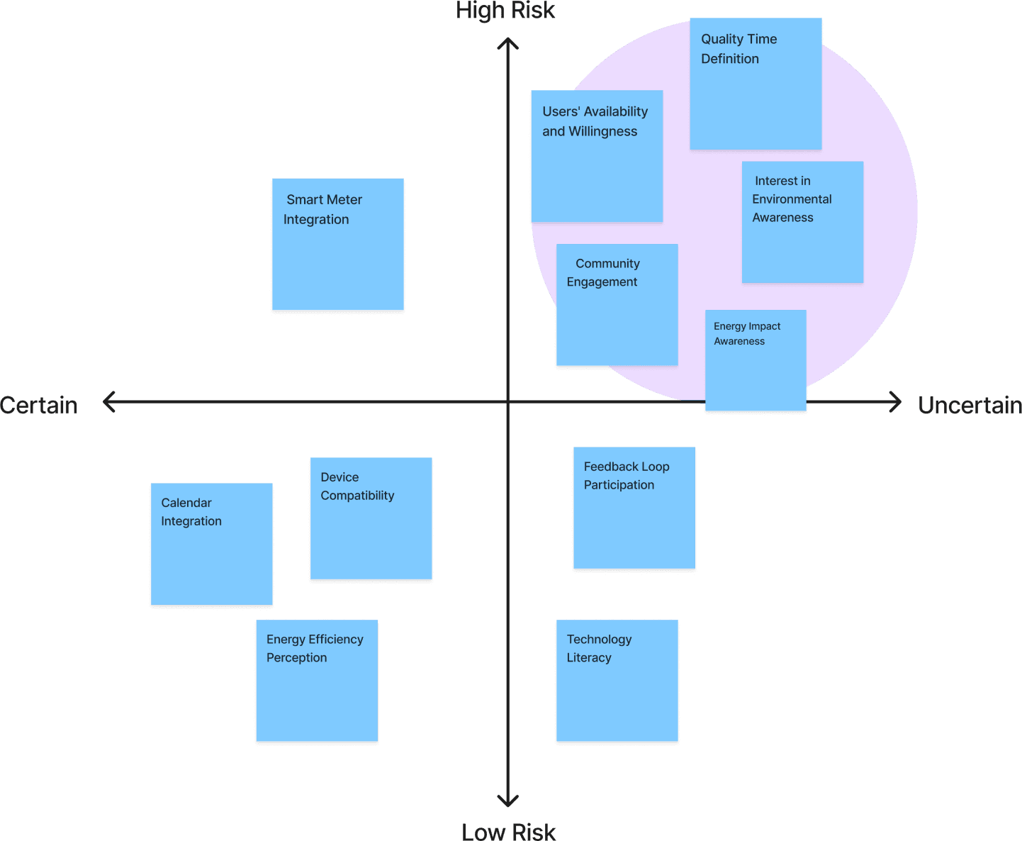
Prioritisation of assumption / assumption mapping
This mapping helped to focus on the needs of the users and which should be the first that needs to be implemented.
Problem statement
“How might we design a mobile app that uses smart metre data to influence money rich and time poor family to control their domestic energy consumption & engage positively in climate change.”
DEFINE
Defining the problem
The research along with assumption mapping pointed out few problem areas to address
- Users availability and willingness to save energy is not that top o priority.
- Spending quality time in this busy world is difficult
- Due to work pressure people prefer to relax without worrying about their domestic energy.
- There is less awareness about energy saving.
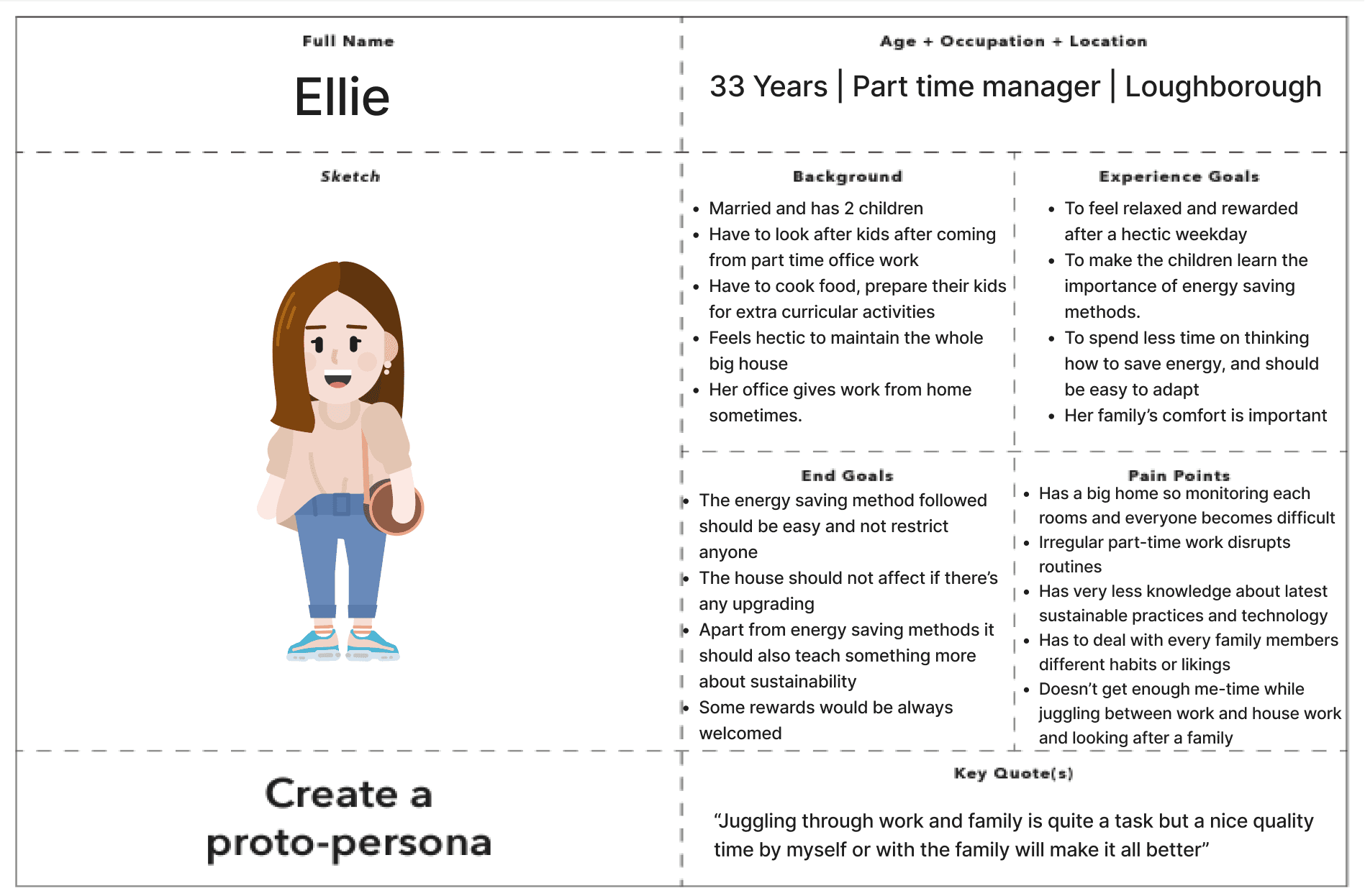
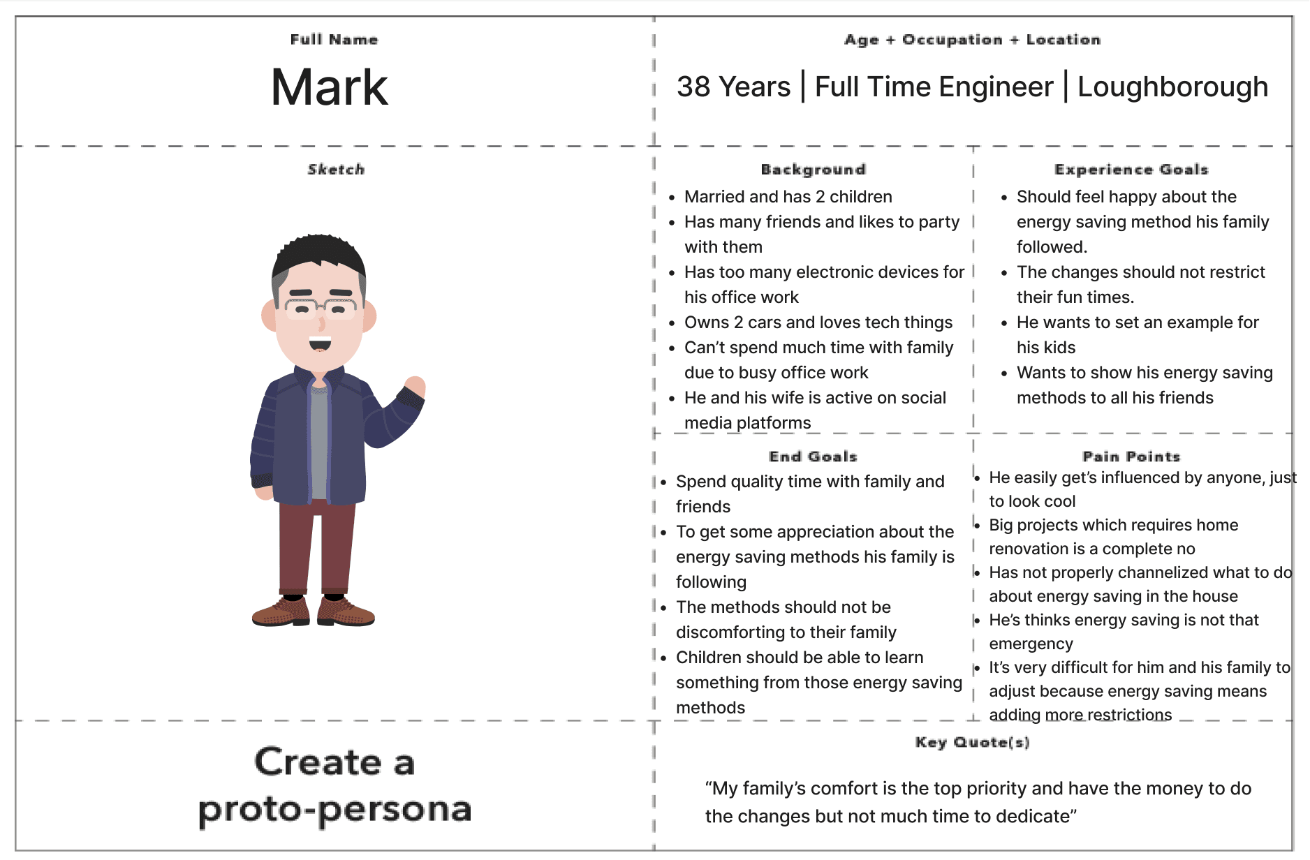
User Persona
Based on the target audience I wanted to focus on a person who defines the family behaviour along with the secondary research adding more details with the assumptions mapping.
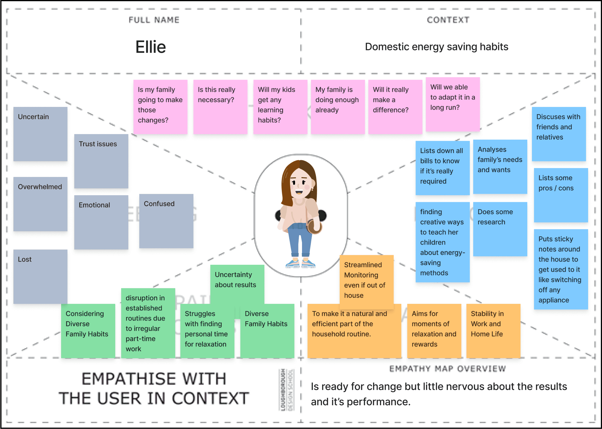
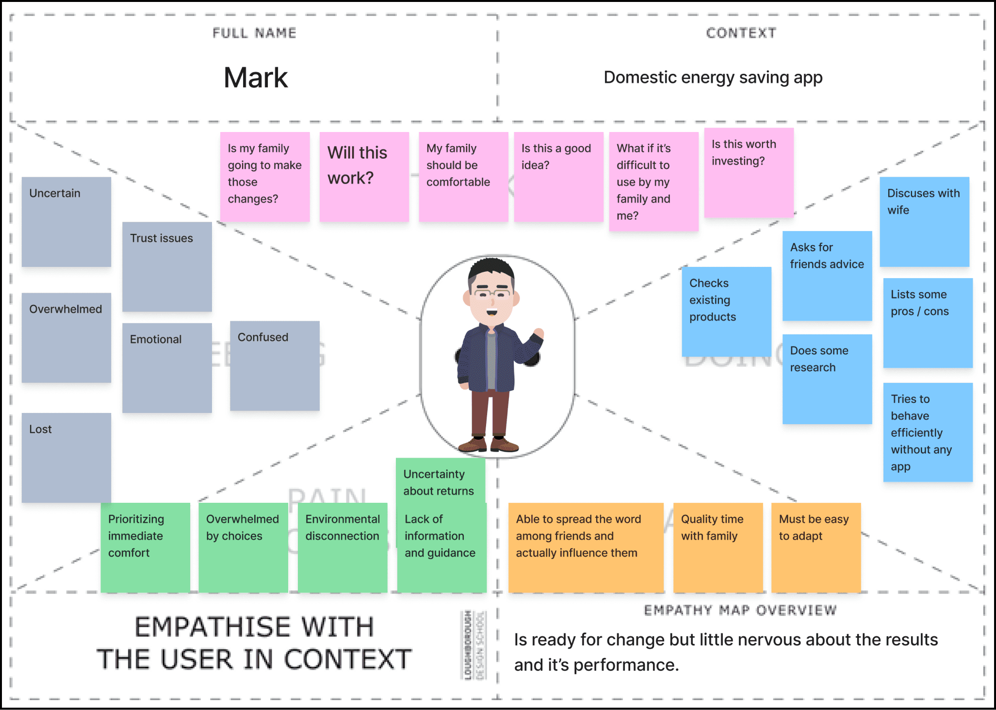
Empathy mapping
The user persona provided insights into the characteristics and preferences of the target users, while empathy mapping delved deeper into their thoughts, feelings, and current behaviours. By synthesising both sets of information, key pain points were identified to address.
User Need statements

Initial UX Vision Statement

Experience Design Principle
Technology Handshake: The app will be well integrated with existing technology and will work in real time
Task Efficient: Users should use the app as completing the pending tasks or to get some benefits from it, so that it increases the frequency of using the app.
Friendly & adaptable: The app offers an adaptable and balanced experience, seamlessly providing valuable information, encouraging sustainable habits without intrusion, and fostering community engagement.
DEVELOP
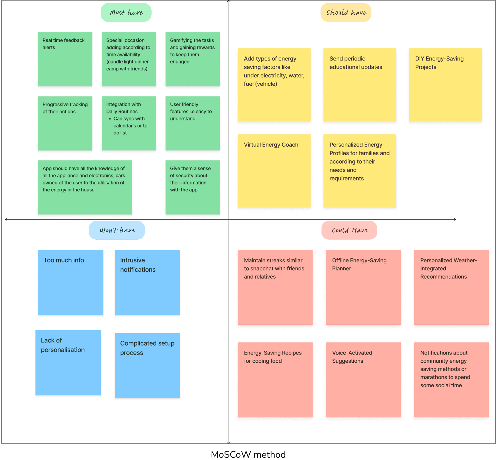
MoSCoW method
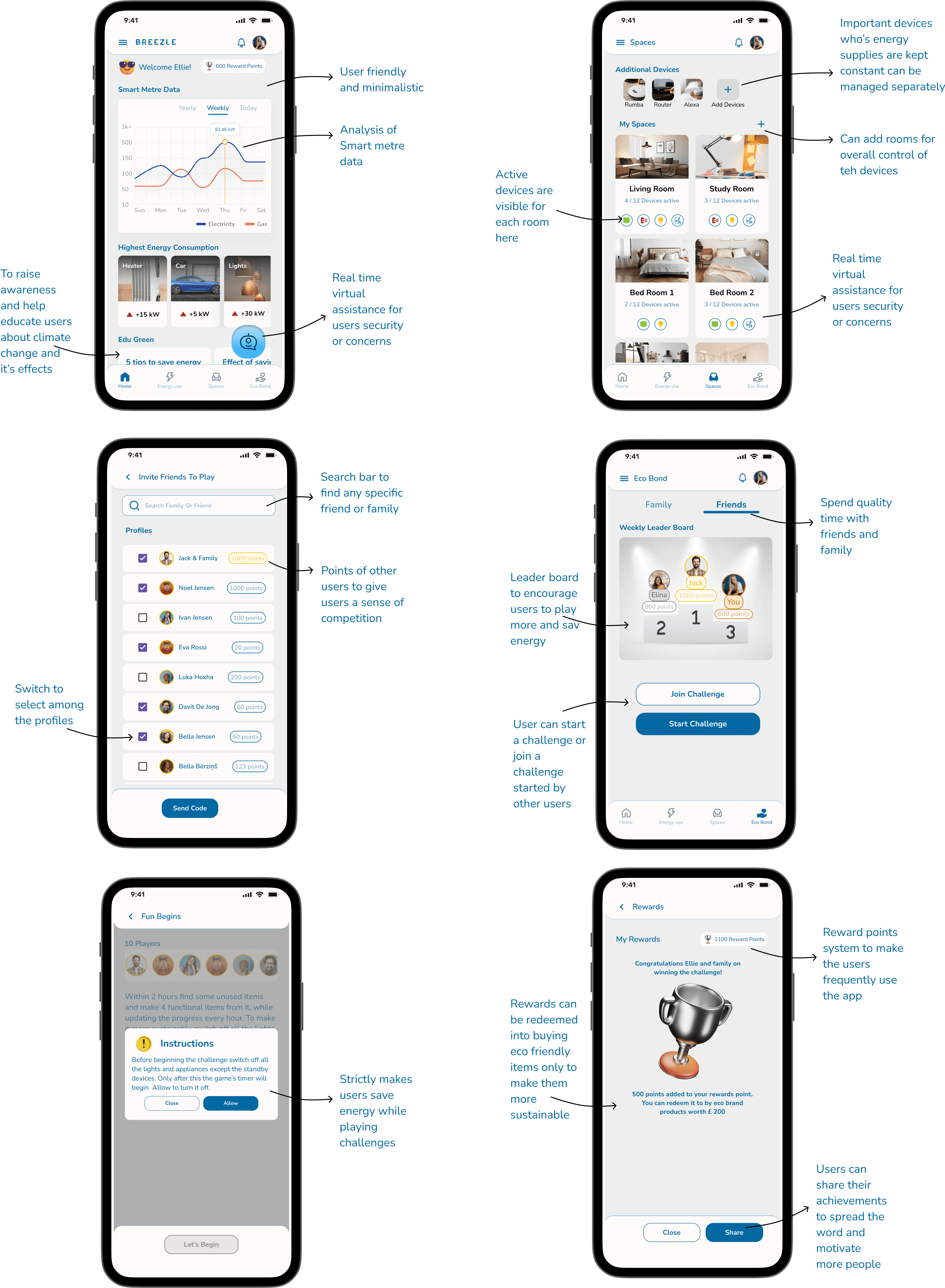
The MoSCoW method was employed to prioritise these features based on their importance. Practicality in real-life scenarios was a key consideration during feature mapping. The design process incorporated assumptions about the family's habits, ensuring that the features align with their needs. The finalised feature set is a result of this methodical approach, aiming to create a user-centric app tailored to the family's assumed preferences and behaviours.
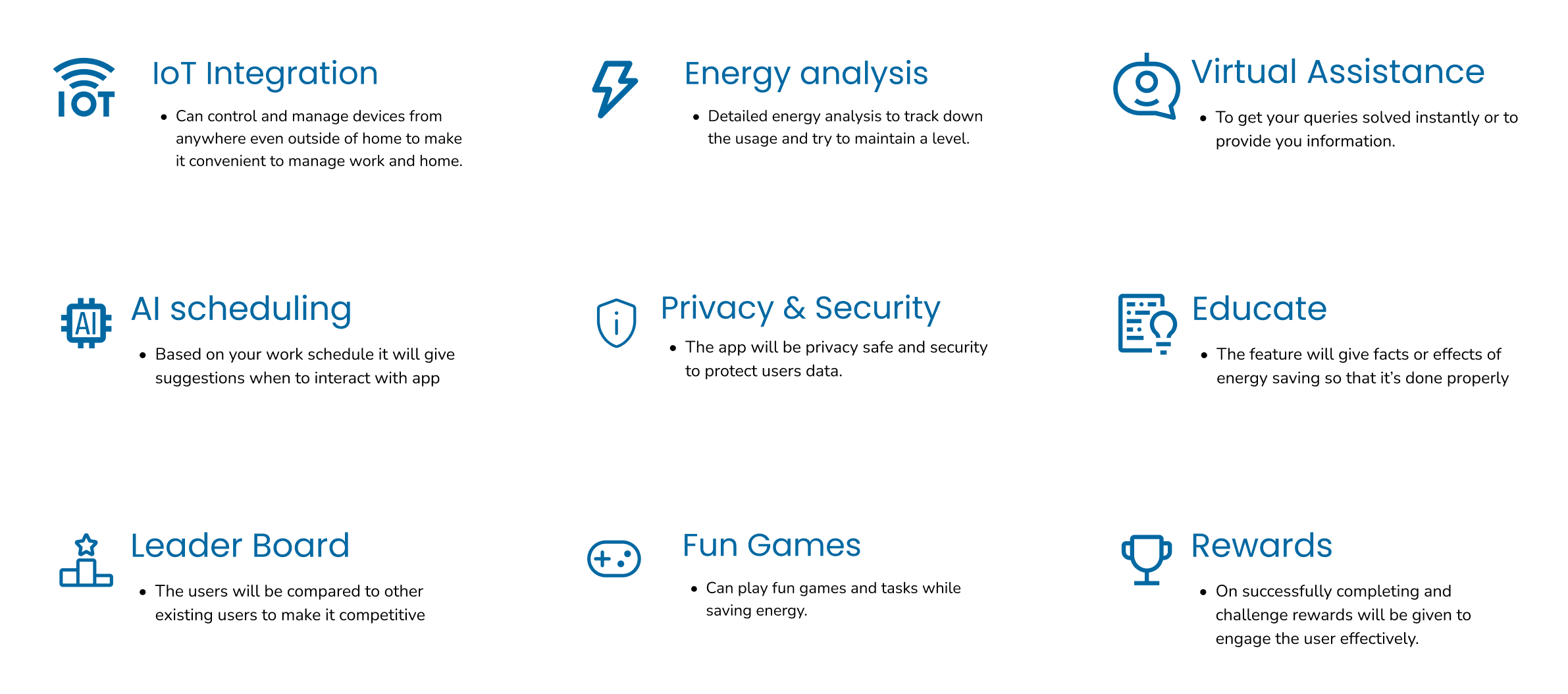
Final Key Features
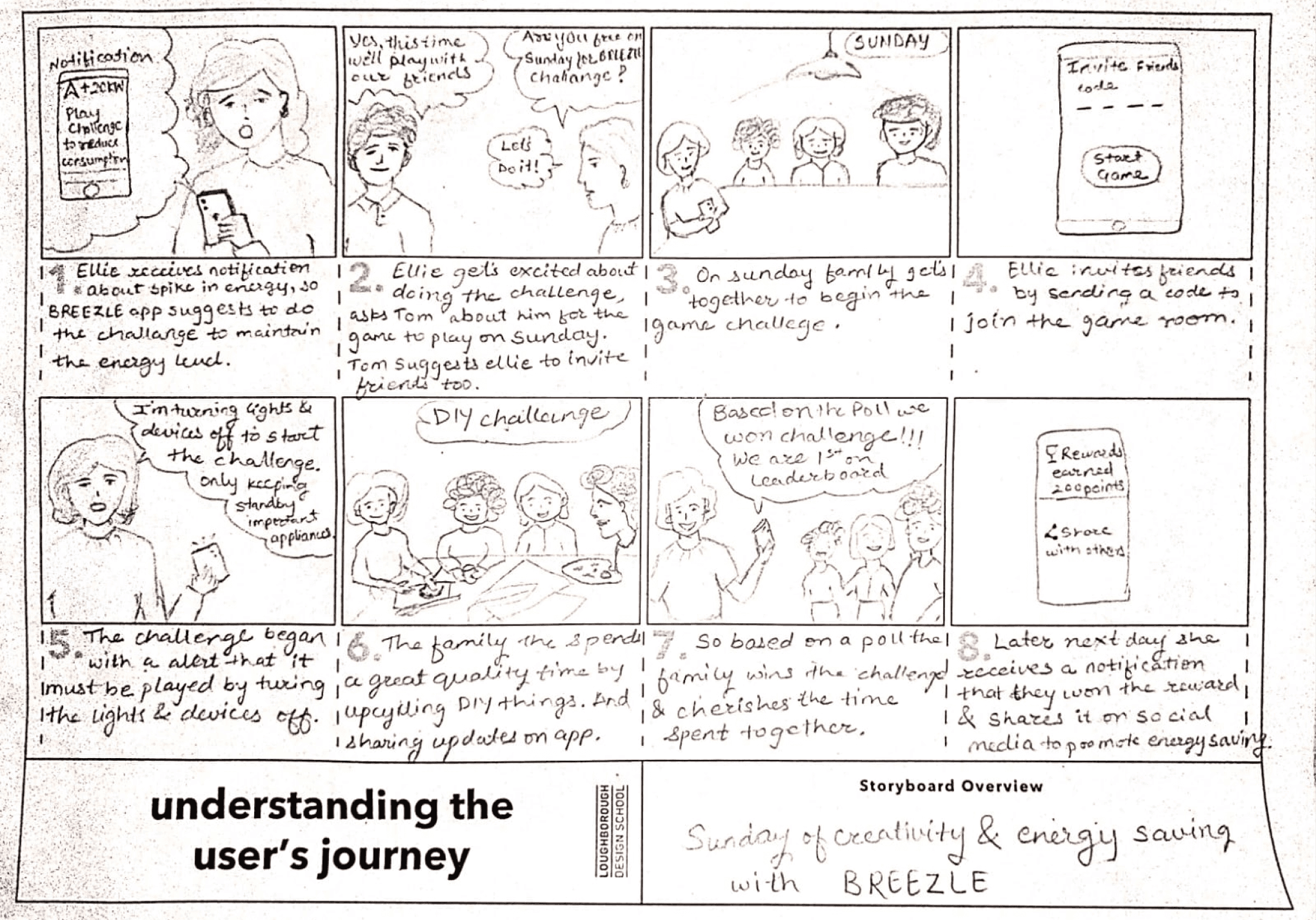
Story Board
Site map
This site map was a description of what will the pages look like, what are there section and features in each section . Different pages are given different colours which are filled with bold colours and section is having the transpaernt colour whereas features are described as bordered box.

DELIVER
Low Fidelity wire-framing

User Testing
After creating the low-fidelity screens, I conducted user testing using the MARVEL app to build a prototype flow based on these initial designs. Since I couldn't find a working professional parent with kids for testing, I opted to do user testing with my roommates. Although there were notable differences in demographics and lifestyle, I aimed to gather valuable insights. This approach allowed me to gauge the user's experience and perceptions, even with a persona that differed significantly from the original target audience of working professional parents with kids.
To initiate the testing process, I assigned the user a task within the app prototype and requested feedback on specific aspects:
- If the layout of the app was understandable?
- Are you able to move ahead with the prototyping?
- Are there any features you liked or if you didn’t understood?
- If they would see these features actually in an app?


Final Key Features
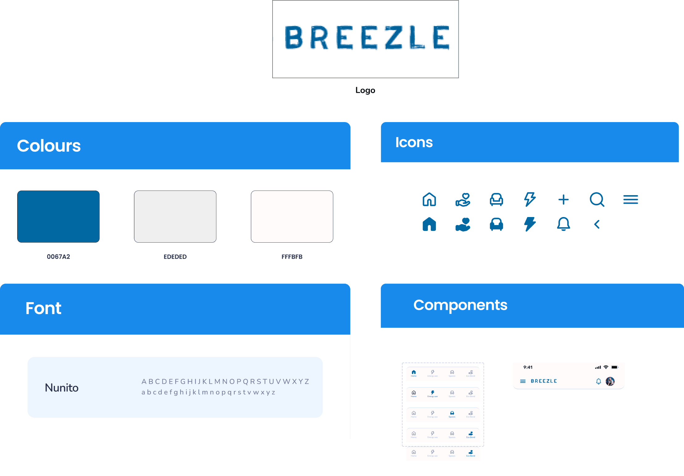
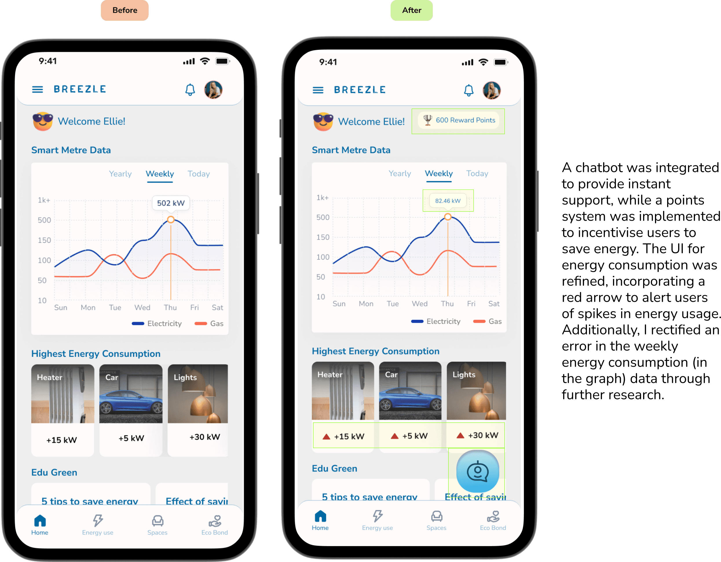
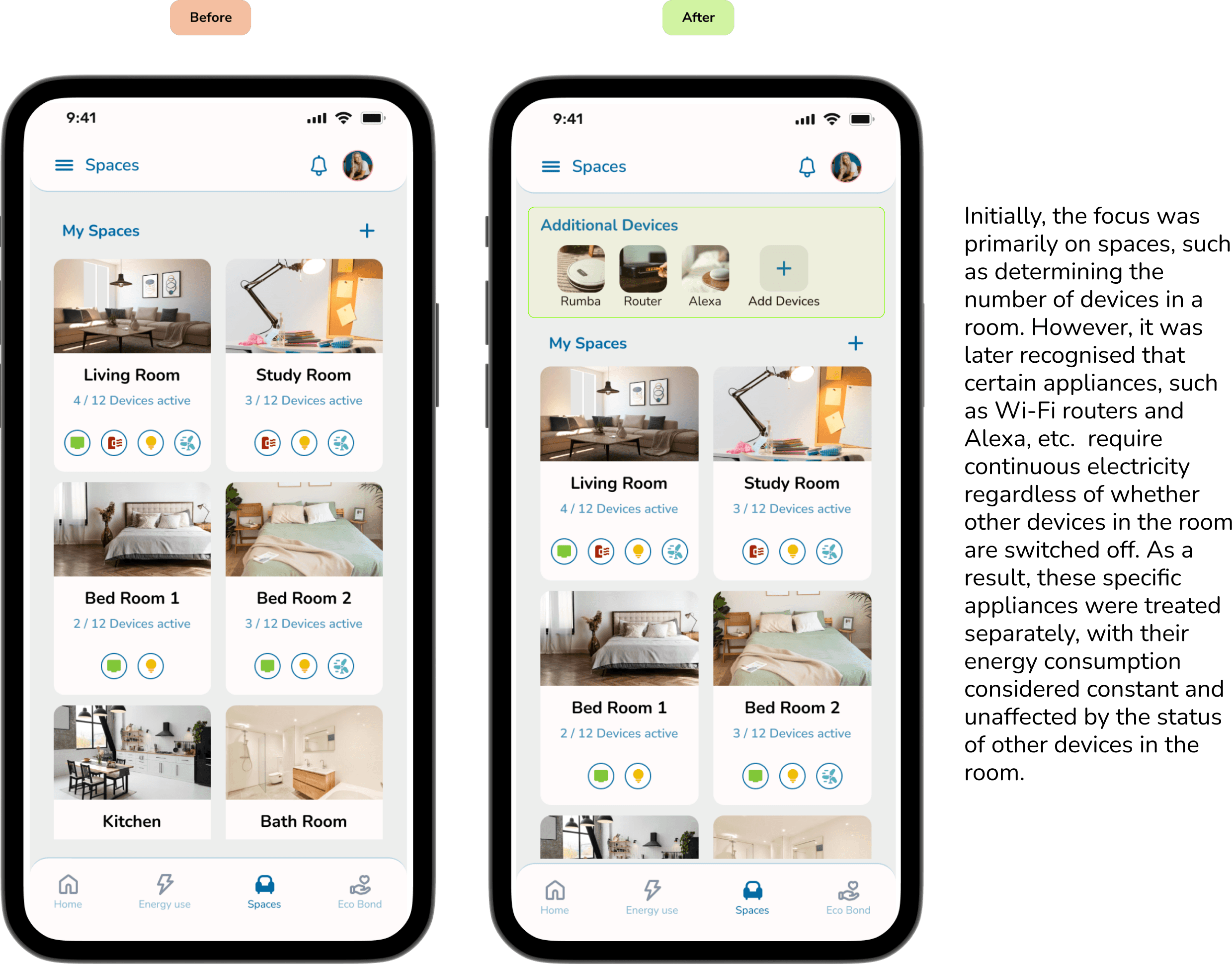
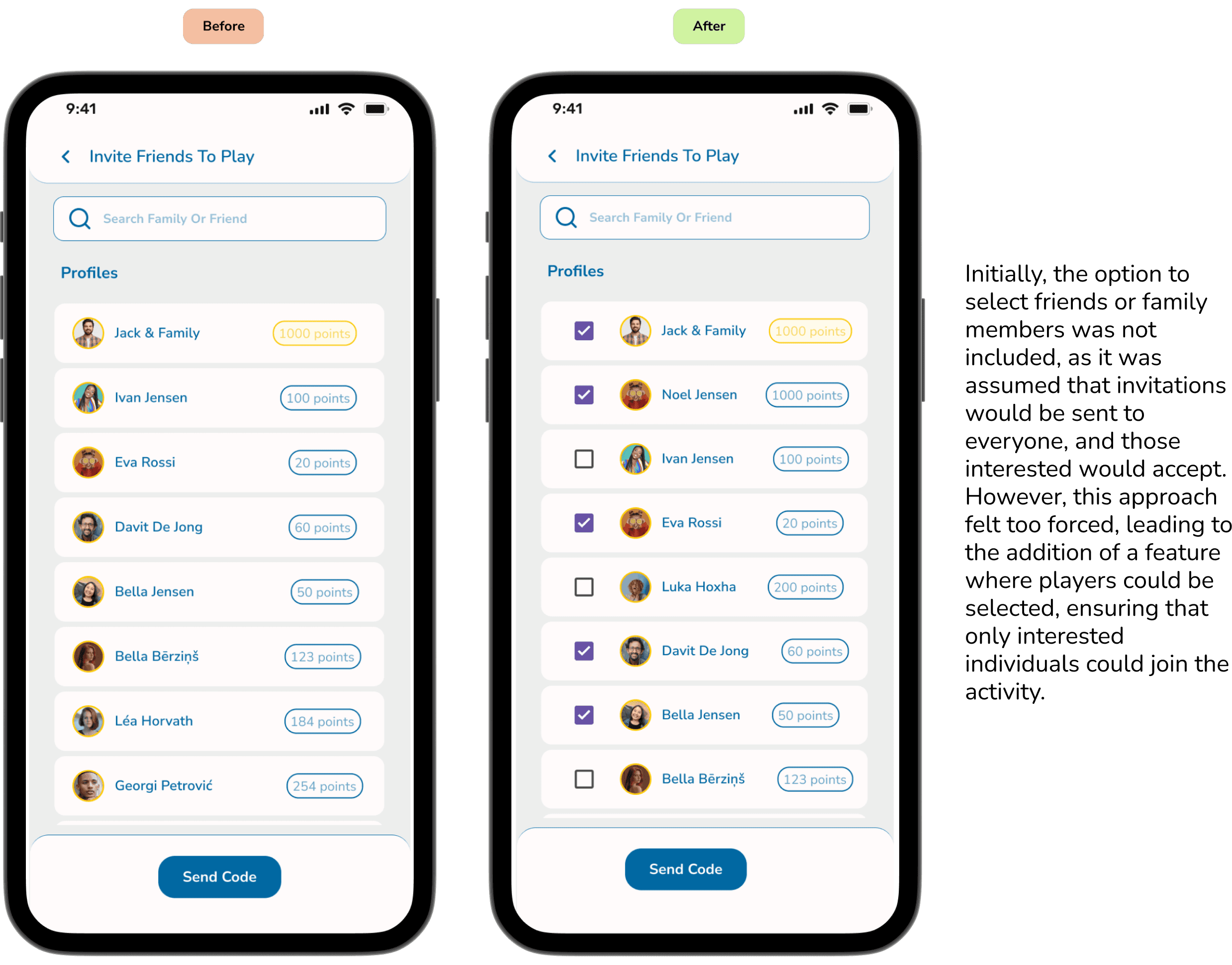
UI Iterations
Reflection
Throughout the design process of this app, I relied on assumptions, highlighting the need for further testing to ensure its effectiveness. My approach involved deeply understanding the perspective of UK users across physical, psychological, social, and cultural aspects, tailoring the app to their fundamental human needs. I've learned that design isn't a straightforward journey; it's iterative. While some areas like information architecture and wireframes required multiple iterations, sketches were constantly refined. Putting users at the forefront of design decisions meant constantly questioning, adapting, and sometimes discarding ideas. I faced challenges, particularly in implementing AI technology, where assumptions about its background operation proved to be a hurdle. Failure to properly integrate smart meter data could potentially undermine the app's success. Smart metre accessing users personal data should also be protected strongly under data security.This experience underscores the importance of thorough testing, adaptability, and user-centric design in creating impactful solutions.
Final UI screens
